
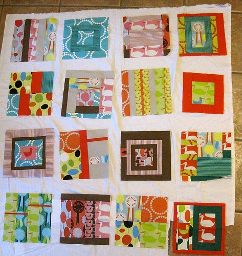
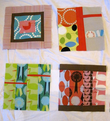
The women of my quilting bee made these excellent Red Letter Day blocks for me last year. I've really been itching to sew them together lately, but I can't decide on the sashing.

There are so many other colors going on here that I'm tempted to go with plain ol' white, but is that too boring?
Please let me know what you think! And head to Naptime Quilter to see who else is participating.


41 comments:
I think I would go with the white. I was going to say Ash, but you have some of that going on in the blocks and I think it would blend too much. Good luck making a decision! The blocks are great!
They're great! I think I would go with a lightish green or light brown - I agree that the white is kind of boring, where normally I love it as sashing. Looking forward seeing the finish!
Maybe I'm boring, but I like white as sashing - it really makes your blocks pop. One other color I like a lot for sashing when you've got really colorful blocks is Kona Medium Gray or Kona Coal. Oooh, you have brown, so maybe Kona Stone, which is a kind of brownish gray...I see I'm not helping much, so I'm going to stop now.... :)
The white looks good, but have you tried a blue? Maybe a really pale blue could tie things together and add a pop of color?
I agree with Kris - a pale aqua would look nice, I think.
Those are beautiful blocks! I like the idea of a gray or a blue as mentioned. White is what I always end up going with because I get nervous but I then later I always wish I had gone with a color!
I'm kind of feeling the gray. I love how it makes colors pop. Can't wait to see what you decide!! Those blocks are beautiful.
I like the white, but I love white in quilts. Those blocks are so colorful that it would really set them off.
I think a medium gray, not light, not dark. My other thought was dark brown.
The white looks great! What a fun quilt!
I like the white. It lets each block shine. Using a colored/printed sashing would cause some of them to blend in and/or make the quilt look too busy.
You might think I'm crazy, but I wonder what it would look like to do a dark brown with large white polka dots? The white just seems a little blah for such vibrant blocks and I would have thought of just solid dark brown, but some of the blocks have solid dark brown borders on them. It probably just depends how "out there" you want the quilt to be!
What happy and bright blocks! I'd go off the chart and use black - the blocks would really POP!
jfquilts@gmail.com
As long as you use a light solid, I think the blocks will look great - you don't want the background to compete... White, off white, beige etc would all work well.
I agree that the white makes the blocks pop - what about a small cornerstone/setting square at each corner? Maybe a small 4-patch made from your block scraps?
I think grey (kona coal?...or if you like lighter kona ash)... or green I think green would work well.
Mmmm... I like the white myself. I could also see black, since you've got some black accents in the blocks. But I wouldn't go with any pale tone.
I like the white, but that's not surprising coming from me. I think white will allow each of the colors to show themselves off nicely. If you went with another color from one of the blocks, I think the other colors might take on a different look. Just my opinion though. The blocks look great!
I like the white a lot. There's nothing like a fresh clean white in a quilt, IMO. : ) And no matter what you use, this quilt will be anything but boring! Those blocks are so colorful and exciting and gorgeous!
how about a lightish aqua? something that still lets the colors of the blocks pop. or! you could do a thin white border around each block and THEN do the aqua sashing. That's what i would suggest. they are fun blocks!
oooh! I like AmandaJean's idea. With that little white border, you can do whatever color you like best without worrying about the colors blednding into the sashing.
I vote for the white. It's a nice clean background for all these awesome colors and patterns. --Marilyn
Light gray as an alternative if you're not digging the white so much. But sounds like we all like it!
I like the idea of a darker border. I think it will make it pop as well as the white. Try it out and see. The blocks are wonderful!
I'm for the white around them. Maybe it can be a thin sashing so the white isn't quite as prominent. Nice blocks!
It is a fresh modern quilt so the white works in my opinion. The blocks are superb!
I like Amanda Jean's idea of a narrow white border around each block, then something outside the box for the sashing. I'm thinking I agree that black or deep grey might be a good choice. I love white, but I think it may be reaching the end of its run - sooner or later another color will pop up as the go-to color - you might want to be ahead of your time rather than go with the crowd!
love the blocks! but i'd have to put in my 2 cents, and say definitley not white. what about grey? kona cotton has lots of great greys. i've also heard that chocolate is the new black...
I like the idea of using the same brown or red solid you did. It would mean that some of the edges would disappear a bit, but I think it would give the whole thing a continuity.
I also like Jodi's idea of using a light green.
What about using a gray similar to the one in pink/gray stripe? You could sash it in a thin white border, and then use gray (or I think blue might work, too).
Some people have mentioned pale blue. I really like that idea, or maybe a pale pink?
And if you are looking to play with the setting, here's an idea. What about combining them in groups of 4? You could sew 4 blocks together to create a big chunk, then sash around those. Or you could use thinner sashing in the groups of four and separate the quadrants with larger sashing. Just for a different take.
I'm thinking pale aqua too. I think it would compliment all the colors nicely. (This is from someone who has never quilted a day in her life, but likes to put colors together in her outfits. Case in point: today I am wearing a cerulean blue cardi with a teal tank top and a purple scarf. I think it works (?).
I'm really liking the idea of white sashing actually because I think it adds a vibrancy to the blocks and helps them to stand out nicely. Plus it just looks so clean and fresh!
I think it would be cool to do one of the colors, gray or dark brown that are in the blocks and here's why: those will look like smaller blocks. Sure you'll lose some of the edges, but the colors, patterns, etc. all still pop
Going along with the idea of whites or light colors, how about putting the squares together in a jumping sort of way? I mean not completely aligned but inside a block put slightly askew, each rotated at a different corner? Just a thought... Looking forward to your next steps!!
the white for sure. the blocks speak for themselves! i love love love these blocks!
maybe, just maybe, since they made the blocks out of Red Letter, use RED sashing. i know it's a bold choice, but everyone everywhere is using white....heck i use white because i love it so much. But RED, now that's a bold statement!
Good luck at picking something to fits what you are looking for!
You know, the white looks really great behind the blocks. If you used the white for sashing and made the blocks tilted like they are I think you will really have something unique. I always love tilted blocks in a quilt.
Great blocks - so eye catching. I like the idea of aqua,red or even a soft lime - keeping it bold.
Katrina
Lovely blocks !! Have a look at Kona celery - it's a very pale and mellow yellowy green ... it's wonderfully neutral and might work really well :)
I would do a dark brown to make the colors pop. I guess it depends on where the quilt will be going and if you want a warm or cool color scheme. I am sure it will look great either way you decide.
Post a Comment